Page 14 - Demo
P. 14
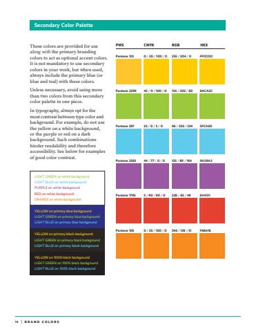
14 | TYPOGRAPHIC STANDARDSSecondary Color PaletteBRAND COLORSPMS CMYK RGB HEXPantone 297 55 / 0 / 5 / 0 96 / 203 / 234 5FCAE9Pantone 2583 44 / 77 / 0 / 0 155 / 89 / 164 9A59A3Pantone 1795 5 / 90 / 90 / 0 228 / 65 / 49 E44131Pantone 2299 45 / 0 / 100 / 0 154 / 202 / 60 9ACA3CPantone 158 0 / 55 / 100 / 0 246 / 139 / 31 F68A1EPantone 123 0 / 20 / 100 / 0 255 / 204 / 0 FFCCOOThese colors are provided for use along with the primary branding colors to act as optional accent colors. It is not mandatory to use secondary colors in your work, but when used, always include the primary blue (or blue and teal) with these colors. Unless necessary, avoid using more than two colors from this secondary color palette in one piece.In typography, always opt for the most contrast between type color and background. For example, do not use the yellow on a white background, or the purple or red on a dark background. Such combinations hinder readability and therefore accessibility. See below for examples of good color contrast.YELLOW on primary blue backgroundLIGHT GREEN on primary blue backgroundLIGHT BLUE on primary blue backgroundLIGHT GREEN on white backgroundLIGHT BLUE on white backgroundPURPLE on white backgroundRED on white backgroundORANGE on white backgroundYELLOW on primary black background LIGHT GREEN on primary black backgroundLIGHT BLUE on primary black backgroundYELLOW on 100% black background LIGHT GREEN on 100% black backgroundLIGHT BLUE on 100% black background


