Page 15 - Demo
P. 15
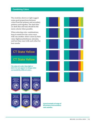
BRAND GUIDELINES | 15 The swatches shown at right suggest some good proportions between colors from the primary and secondary palettes used together. The dark blue (or dark blue and teal) should be the main color(s) when possible.When selecting color combinations, keep in mind how the colors react with one another. Select colors by their value (lightness/darkness), intensity, and how they react with each other for best results. Combining ColorsCT State YellowCT State YellowThe value of a color (how light or dark it is) can appear to change when surrounded by different colors.A good example of usage of the primary and secondary color palettes.


